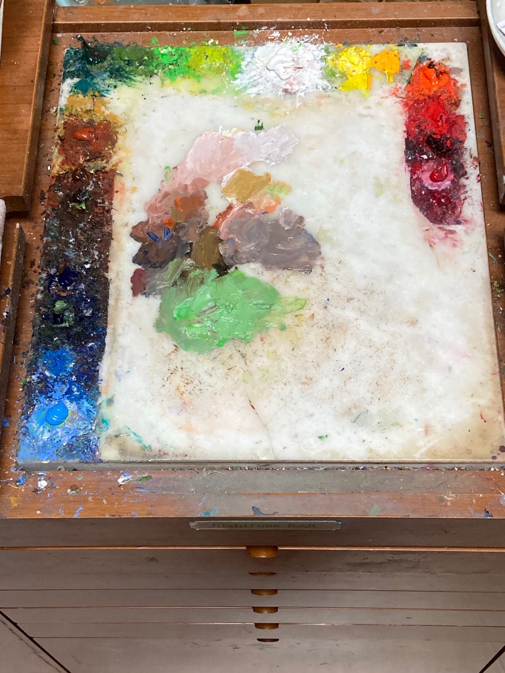
I have, for over a decade, used Blockx oil paints. As I talked about this theme before, I went this route because of the rich quality and purity of color and rich color variation. I have no hesitation in revealing my pallet color I usually use to anyone, and for now I’ve listed my colors below.

• Rose madder
• Madder root tone
• Cadmium red
• Cadmium red orange
• Cadmium yellow deep
• Lemon Yellow
• Flake white
• Gold green
• Permanent green pale
• Cinnabar green
• Viridian
• Yellow ochre
• Venetian red
• Burnt sienna
• Burnt umber
• French ultramarine
• Ultramarine violet
• Royalblue
Madder root tone (mussini) is almosty alike Alizarin. Transparent and excellent lightfastness because it’s quinacridone. Usually I use madder rake or crimson, but I sometimes enjoy changing similar color variations. Cinnabar green is really opaque and quiet color, it’s very easy to control chroma. Venetian red is basic and indispensable color for my work. I usually start first paint with this color. As the work progresses, I love a glimpse of Venetian red color behind the shapes.
Royalblue (made by lefranc bourgeois) is very important color for painting sky, water, and shadow color.
Pallet is mostly a personal choice. I really prefer a large natural marble stone plate to wooden pallet.
I think there are many ways to accomplish a satisfying and successful painting. And the proper materials must be seriously selected in the practice of a work. But keep in mind the most important tool is how you think about and get inspired by the creative process.
